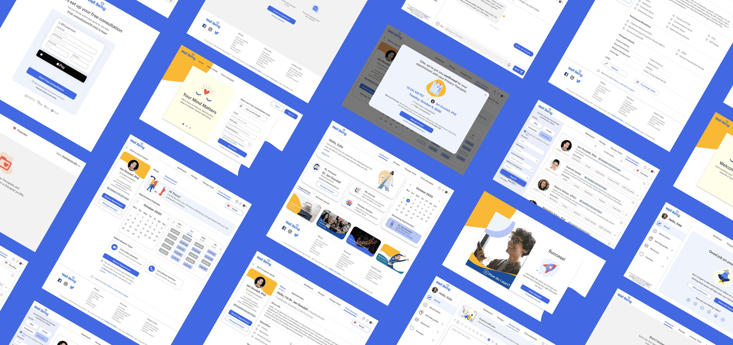
Designing a teletherapy web app for finding better mental healthcare anywhere, anytime.
Overview
Team
Independent Project
Role
UX Research, UX/UI Design
Tools
Figma, Illustrator, Photoshop, optimal sort, Usability Hub, Marvel App
Problem
The world of mental health has changed over the course of the past decade—more people are willing to recognize mental health as an essential part of one’s well-being. Moreover, the global pandemic has changed the way we seek help for mental health and support, with work from home and video conferencing becoming the new normal.
Well Being is designed as a web app that allows individuals to access therapy tools and teletherapy through video conferencing and online messaging on their own terms.
The Problem
With many mental health practices moving online during the pandemic, individuals struggling with stress and anxiety needed a way to access better teletherapy services to help manage their mental health.
The Solution
Create a positive and engaging experience for users to find the right therapist based on their preferences and needs. Provide comprehensive resources and essential therapy tools to improve their mental well-being.
00 // Approach
01 // Understand
Competitive Analysis
Research Goals
To understand what impact the pandemic is having on users’ mental health and what resources and activities they use to cope during the pandemic.
To uncover user needs, motivations and behaviors when choosing online and in-person therapy.
To document their pain points, constraints, and experience with teletherapy.
Key Insights
Search functions are limited and/or non-existent.
Lack of availability of therapists decreases users’ satisfaction and retention.
Users want to be able to seek therapists based on their preferences.
Visually appealing interface design is key to keeping users engaged.
Users are hesitant to use online therapy because of impersonality and privacy.
How Might We…
How might we offer a higher degree of anonymity and privacy that allows users to express their emotions without worrying about judgment.
How might we create a positive and streamlined experience for users when searching the therapist that matches their needs.
How might we create a positive and engaging experience when seeking therapy.
02 // Ideate
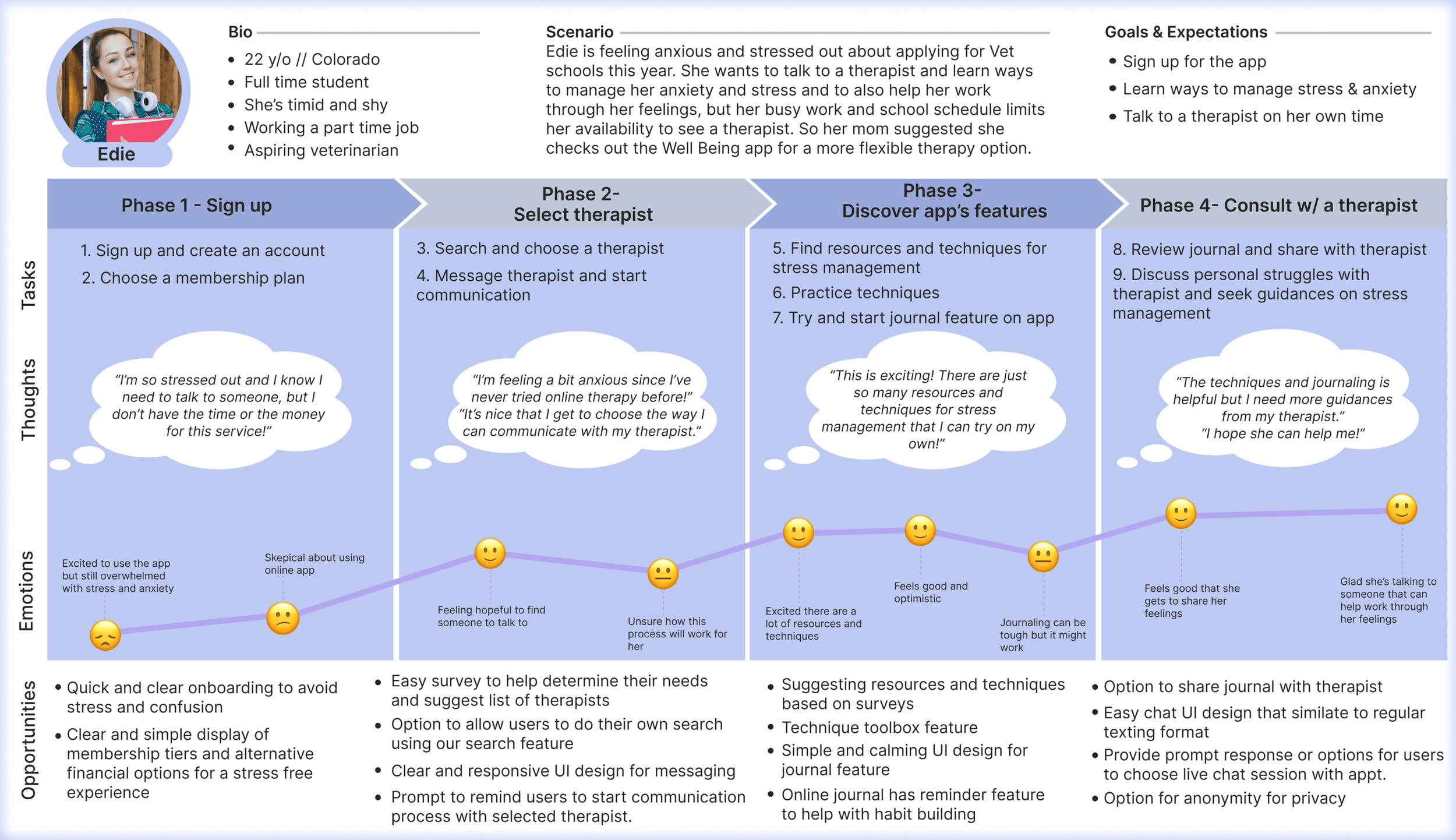
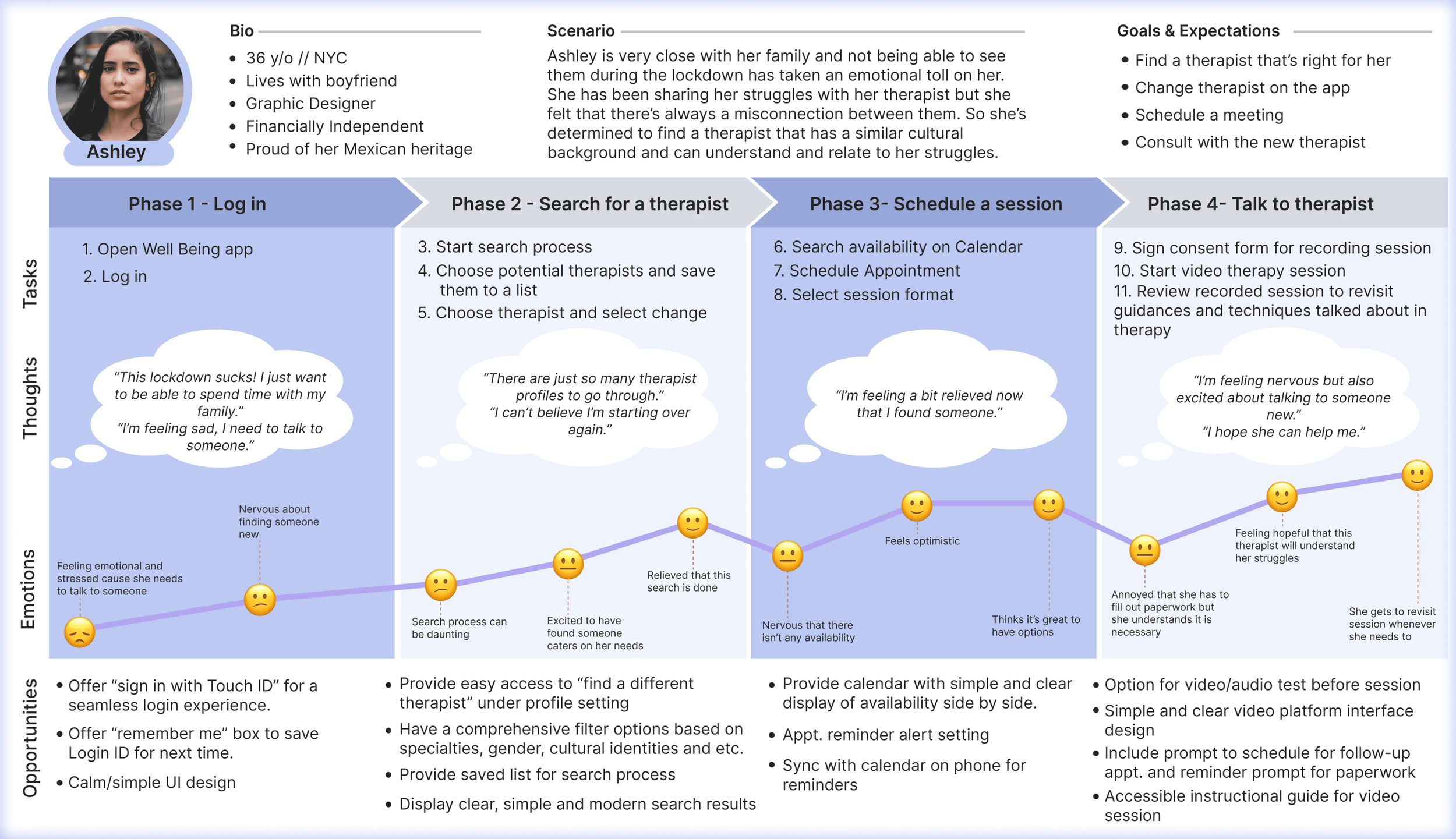
Personas & User Journey
Based on the findings and insights from the user interviews, I created two personas and user journeys to help empathize with my target audience. These served as reference points throughout the design process, focusing on who might be using the product and what their goals and motivations were when making design decisions.
User Flows
With the help of the personas and user journeys, I created user flows based on their goals and needs. This helped lay out the foundation for the information architecture (IA) and to prioritize the key features for the Well Being app.
Objective: Find a therapist and book an appointment.
Entry Point: Home
Success Criteria: Book appointment
Objective: Save journal entry and share with therapist.
Entry Point: Home
Success Criteria: Share journal entry with therapist
03 // Prototype
Wireframes
Using the sitemap and user flows, I started to hand sketch wireframes of the app in both mobile and web version. With hand sketching wireframes, I was able to experiment with several layouts of the app before putting the final version into Figma for mid-fidelity wireframes for rapid prototyping.
Lo-Fi wireframes of both responsive mobile and web app above.
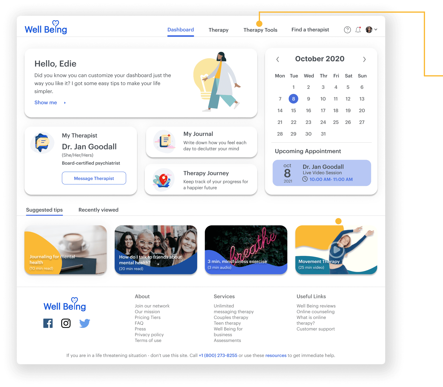
Mid-Fi to Mock up Screens
04 // Research, Tests, & Iterations
Test Results
After conducting six remote testing sessions, the test results and data were analyzed using affinity map and spreadsheets to help identify usability issues and what to improve. No big usability issues occurred during each session and most participants were able to complete the assigned task without any intervention or guidance.
I synthesized the data and created a list of issues for improvement next iteration:
Subscription requirement prevented further commitment.
Users did not understand what to do with Toolkit from Navigation Bar.
Users would like to have the option to skip coach marks to explore the app freely.
Too many search result boxes caused minor cognitive overload for first time users.
Users would like to be able to book appointments in fewer steps.
Test Iterations
Dashboard
Some users did not understand what toolkit means and used a different method to complete the task without exploring this nav. tab. To help clarify, I renamed toolkit to “therapy tools” for easy understanding.
Therapist Profile
Therapist profile detailed too much information on one page, causing some users difficulty deciding what to focus on.
I created a sub nav. bar on the top screen to create easy access to appointment and easy viewing to prevent cognitive overload. The search filter panel did not serve any purpose, so I replaced it with a static profile card to create less steps to book an appt.
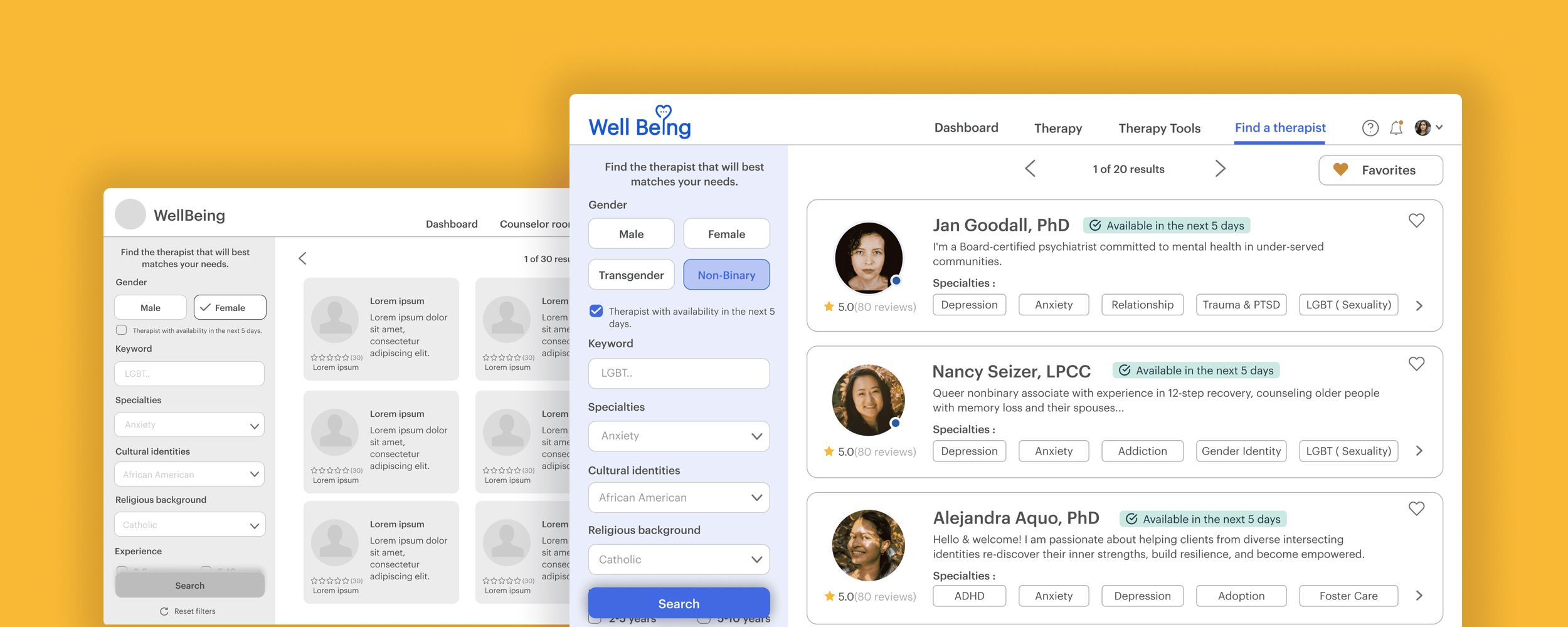
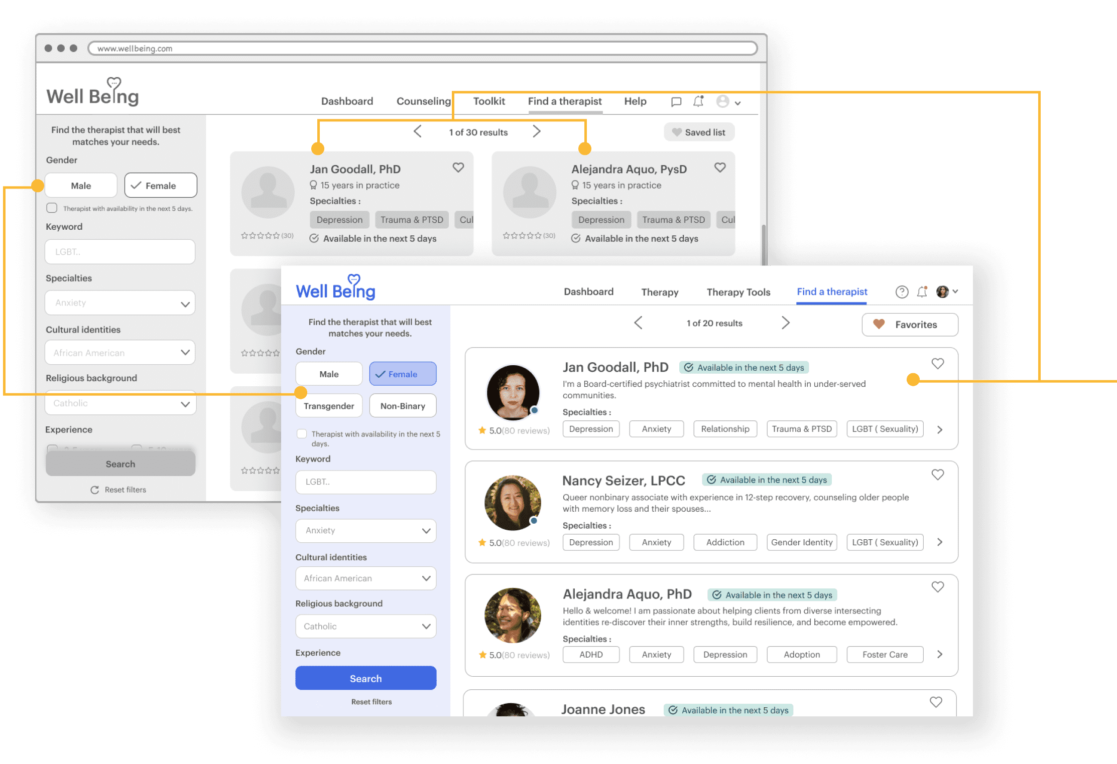
Search Filter + Search Results
With too many results placed in one page, it prevented users from focusing on the search. I fixed this by creating single column profile cards to show pertinent keywords to help users with decisions. I also added a gender filter for a more inclusive design.
Design System
Throughout the design process, I was cataloging all of Well Being visual design elements and documents in the Well Being design system. Below is the design language system explaining Well Being’s visual identity and a library of components that allow the team to develop the app in a consistent way.
Well Being Design System at-a-glance
Final Prototype
Reflection // Opportunities
Focus on Practical Solutions
I created the prototype with Figma to help simulate the basic interactions of the app and its features for user testing. This prototype will go through multiple iterations as we continue this design process.
Opportunities for Diverse Recruitment
To have the opportunity to recruit a more diverse range of participants, including both users and providers for both user research and testing, would have likely provided additional insights on improving my app.
Thanks for your time - Have a great day!
